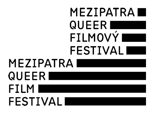
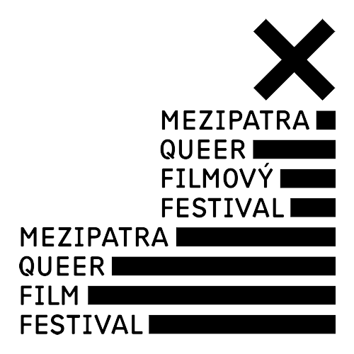
10th edition introduces a new festival logo
 Prague and Brno, 23/7/2009: On the occasion of its 10th edition, Czech gay and lesbian film festival Mezipatra changes its subtitle and logo. The New visual identity is being created by a prominent Czech graphic designer Jan Kolář.
The popular festival, which attracted over 63 000 viewers in the course of nine years originated as Duha nad Brnem (Rainbow over Brno). The title alluded to the international symbol of gay and lesbian liberation movement. After two years, the festival started taking place also in Prague and other cities in the Czech Republic, thus a change of title was necessary. Mezipatra means Mezzanine and the word is a metaphor for a meeting point of various kinds of people regardless of the direction they are taking. The festival audience is equally represented by straight and non-straight audience, which makes it a space for understanding different lifestyles and identities.
The festival enters another decade of its existence with an altered subtitle - Czech gay and lesbian film festival is now replaced with queer film festival. The internationally used term "queer" liberates from the traditional understanding of sexual and gender identities based on rigid categories male/female, homosexual/heterosexual.
The festival director Aleš Rumpel explains: „Queer includes lesbians, gays, bisexuals and transgender people as well as nonconforming heterosexuals and people who reject traditional labels. By using the word queer we would like to point out the ruling heteronormativity, i.e. belief that heterosexuality is the only normal and natural orientation with everything different being an aberration.“
The new logo was designed by Jan Kolář, laureate of many prestigious awards including the National Design Award and the author of corporate identity styles of the cities of Pardubice (2004), Olomouc (2008) and district Královéhradecký (2005).
The designers explication: „Logotype is conceived as two blocks of text composed into the shape of a flight of stairs (floor). Typography is accompanied by a graphic element of stripes. These stripes express:
a) film reel (film)
b) censorship in text (queer)
c) statistic percentage chart (4%)
d) movement (altimeter)
e) floors (Mezipatra - Mezzanine)
The basic logotype has a jubilee version, which is complemented by the Roman letter ten, also symbolising a ruling out cross or a person X.
The entire graphic style is designed in black and white as this colour scheme best represents traditional cinematographic visuality. It also highlights the queer aspect, something rebellious, unconventional. “
The festival spot for the 10th edition of Mezipatra will be shot by the controversial visual artist Mark Ther, whole solo exhibits took place in such prestigeous venues as the City Gallery Prague or Brno's Galerie G99. The festival will take place in Brno 23-31 October and in Prague 2-8 November 2009.


Logo for download:
- basic version (ZIP, 430 kB - formats AI, EPS, PNG, PDF)
Contact for media:
- Kateřina Horčicová, PR manager
- This email address is being protected from spambots. You need JavaScript enabled to view it.
- GSM: +420 608 508 038

